A logo is one of the most important components of a brand. This graphic identity reflects how your business should be perceived by the rest of the world – your customers, clients, employees, investors, partners, and vendors.
Like a firm and friendly handshake in a personal introduction, a logo should leave a positive impression.
Like the foundation of a house, the logo needs to support and complement all of your advertising, marketing, and social media efforts for years to come. The memorability of a brand grows exponentially with the recall of a logo.
What Can a Logo Do for Your Business?
A logo instills trust. Whenever I see a good logo, I think, ‘Well, if they can put that much thought into their logo and their branding, they’re probably doing a lot of other things right with their business, too.’
A logo can exude strength, authority, confidence, personality and optimism.
A great logo can help turn a company into a status symbol. A great logo can help entrepreneurs or small businesses gain traction sooner. A great logo can help a product stand out on crowded shelves.
A mediocre one will make it harder to compete. And a bad one may actually repel business.
If you ignore the process of creating a good logo, the chances are high that potential consumers and clients will ignore your products or services. You haven’t given them a reason to stop and look.
So, it’s well worth the time and effort to explore how to make your logo stand out with the help of a professional graphic designer or art director. Someone who has the training to create unique brand identities as well as choose appropriate fonts and colors.
It used to be that logos were initially used for business cards and stationary. Now, there’s another essential purpose. “I won’t design a logo today without envisioning how it might look in a circle,” stated designer Phil Holmes, “ Because all logos will end up in social profiles framed by a circle.”
Companies of all sizes can make the mistake of not updating their logo over time. The set it and forget-it mentality is easy to do when there are seeming a million of logistics to take care of every year. It’s so easy to put updating a logo on the back burner.
21 Signs It’s Time to Update Your Logo.
1. It wasn’t created by a professional graphic designer or art director in the first place. Your company’s founders cut corners when it launched.
2. It’s a family-run business. It hasn’t been updated in well over a decade.
3. It doesn’t look good online – on a website or social profile.
4. It doesn’t work well because it’s too busy or ornate.
5. Its type isn’t legible. For example, a font with a fine script.
6. It’s way too big or small.
7. It isn’t aesthetically pleasing. It’s the elephant in the room that no one wants to talk about, but many would like to see it change.
8. Its shape may be overused or cliche for your industry.
9. Its color is garish. Maybe it looks a little muddy when it’s printed. Maybe it’s not an appropriate color choice for your industry or target market.
10. It doesn’t stand out amongst your competitors. (Maybe your competitors’ logos don’t stand out either. That’s a big opportunity to level up with a better one.)
11. It doesn’t represent the company’s product or services.
12. It doesn’t represent the company’s personality.
13. It doesn’t complement the rest of the company’s marketing.
14. It’s not memorable.
15. It doesn’t fit the product niche. An unsophisticated logo design is not going to help sell a high-priced item or service.
16. It does not look good on packaging.
17. It is used discretely in very few places besides the location, business cards, and website. You won’t see it being used on the company’s uniforms, shirts, delivery trucks, communications, events, etc.
18. The details of it are marred and sort of bleed together or look blurry. (Kind of like the ink of an old tattoo.)
19. It is being used in incongruent sizes and colors by different departments in a company without any adherence to brand guidelines.
20. It was inherited after the company was bought out.
21. It hasn’t changed since there was a merger.
How Does the Logo Design Process Work?
I’ve gone through the logo design and redesign process multiple times with clients and for myself.
When I initially had a logo created for my writing business, I wanted something that showed I was both a visual and strategic thinker. I had taken a lot of creative advertising workshops and earned a marketing degree. Many copywriters have English degrees.
I had this idea of a pencil hitting a target like an arrow. My designer used bright yellow and red colors. At the time, most of my competitors had their information in type only. I often received compliments for having a logo and colorful business card.
Over the years, I think that first design went through three different iterations. The shape of the pencil changed. The thickness of the lines changed. It evolved as my needs changed from just a business card to direct mail and a website.
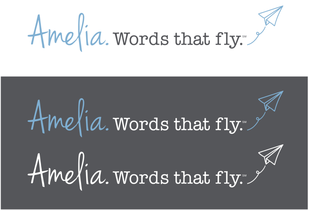
Then I decided to go in another direction altogether. The designer who helped me really wanted a logo that played off my first name “Amelia” to make it memorable like Amelia Earhart. At first I hesitated. I had seen a paper airplane design come up for other businesses like email apps. We kept exploring her idea and when the tagline “Words That Fly” popped up, it all just worked. I had a logo and a tagline that I loved. It took a few days of chipping away at it, feeling stuck, waiting for the inspiration, and then finally, no pun intended, landing on it.
 Often the need for a change occurs when business slows down in a recession, there’s the excitement of a new product launch, or there’s a change in staff – something that spurs deep reflection.
Whether the impetus is survival or a healthy growth mindset, the first step should be meeting with a professional graphic designer or art director, and discussing your company’s product or service offerings and plans for the future.
Together, you’ll want to perform an audit of all your existing marketing materials and any places where your logo appears. What’s working? How could it be improved or revamped? Could it be accentuated with a new tagline?
It would be super helpful to prepare for this meeting by conducting a competitive analysis of your direct competitors. Be sure to gather screen shots of all their logos. Tape them to the wall of your “war room” and discuss what you like and dislike about them. That way, your designer can see the shapes and color schemes to steer away from for your logo. And, you’ll spark his or her competitive juices to beat them.
Once the designer gets a feel for your business and puts together a proposal of how many unique designs to expect before refining the final selection as well as the color and black-and-white versions of that logo.
It’s a well though-out process that could take days or weeks, depending on everyone’s schedule and the agility of your team’s internal decision-making process. Picking the final logo is a big step that will have a lasting impact on your company.
Whenever I’ve observed it firsthand, it’s been exciting to watch. It’s like seeing a reality show makeover, except it’s for the business’s new look. It’s always rewarding to see how the changes in perception unfold.